Become an insider!
Get our latest payroll and small business articles sent straight to your inbox.
In this Article:

Let’s face it. We live in a time where ‘dated’ websites have become a major decision factor when considering whether to work with someone or not.
It’s especially important if you are thinking about growing a software company in a cluttered and competitive space.
Websites do a lot more than inform people about what your company does, they convey your personality in the style, fonts, colors and in the tonality of your copy. Added to that, if you are considering optimizing your website for conversions, you might find it better to start with a blank slate vs. testing elements on your existing website.
For those reasons, we decided to undertake a total redesign of our website.
While we had a lot of fun illustrations and copy in our previous website, we realized that we might be sacrificing communicating a better message for the ‘quirk’ factor. The other problem was that we didn’t have a tight enough path to guide the user towards. We knew there were some structural problems with the website that would require an overhaul.
But re-doing a website with 20 pages or more can be overwhelming so how did we decide what elements were important enough to build right away and which ones we could postpone?
And more importantly, how did we achieve a 75% increase in conversion?
Iterate, Rinse & Repeat.
As a startup, you have limited resources to throw at every problem so prioritization becomes the lifeblood of your company. Pick the wrong tasks to prioritize one too many times and just like that, you run out of time and money.
So, we decided to start small with just the most important pages. To decide which ones would make the cut, we checked out our most visited pages in Google Analytics. We also made sure we factored in pages that had actually seen conversions. The results were clear and the winners were:
Home, About, Contact
In other words, visitors mostly cared about learning about the ‘what we do’, the ‘who we are’ and the ‘how do they get in touch’.
In hindsight, this seems painfully obvious but we are taught so early on about the myth of the scrolling that we tend to worry about stuffing one page with everything from features to pricing and overwhelming the user.
But that’s exactly what we did. And, it worked.
We decreased our overall bounce rate by 10%. That meant, of the tens of thousands of visitors that land on our website, we were able to get at least 10% more of them to visit at least one more page! More pages seen generally equate to more engagement and familiarity with the brand so naturally, we were pretty happy with the outcome.
Design has to be in the background.

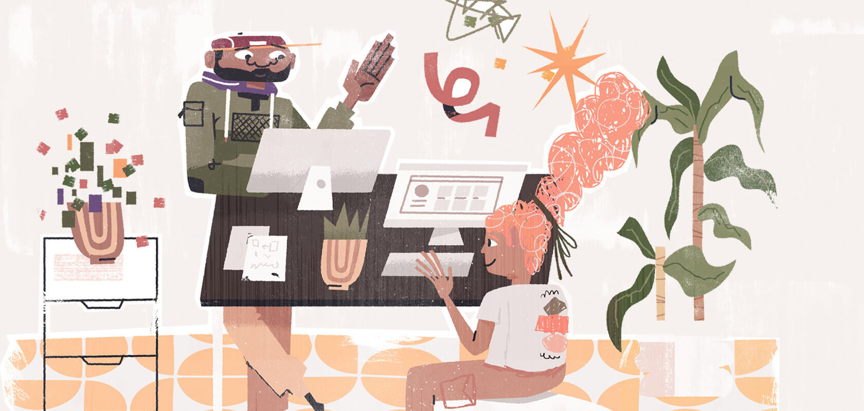
Another big change in our new website was our reliance on visuals. Because we have a remarkable illustrator in the house, we used to look for reasons to use his superpowers. But we weren’t sure the illustrations were good from a conversion standpoint. So, for the new website, we decided to add a lot more copy into the mix.
With a product like ours it isn’t about making the hard sell. Education is the goal.
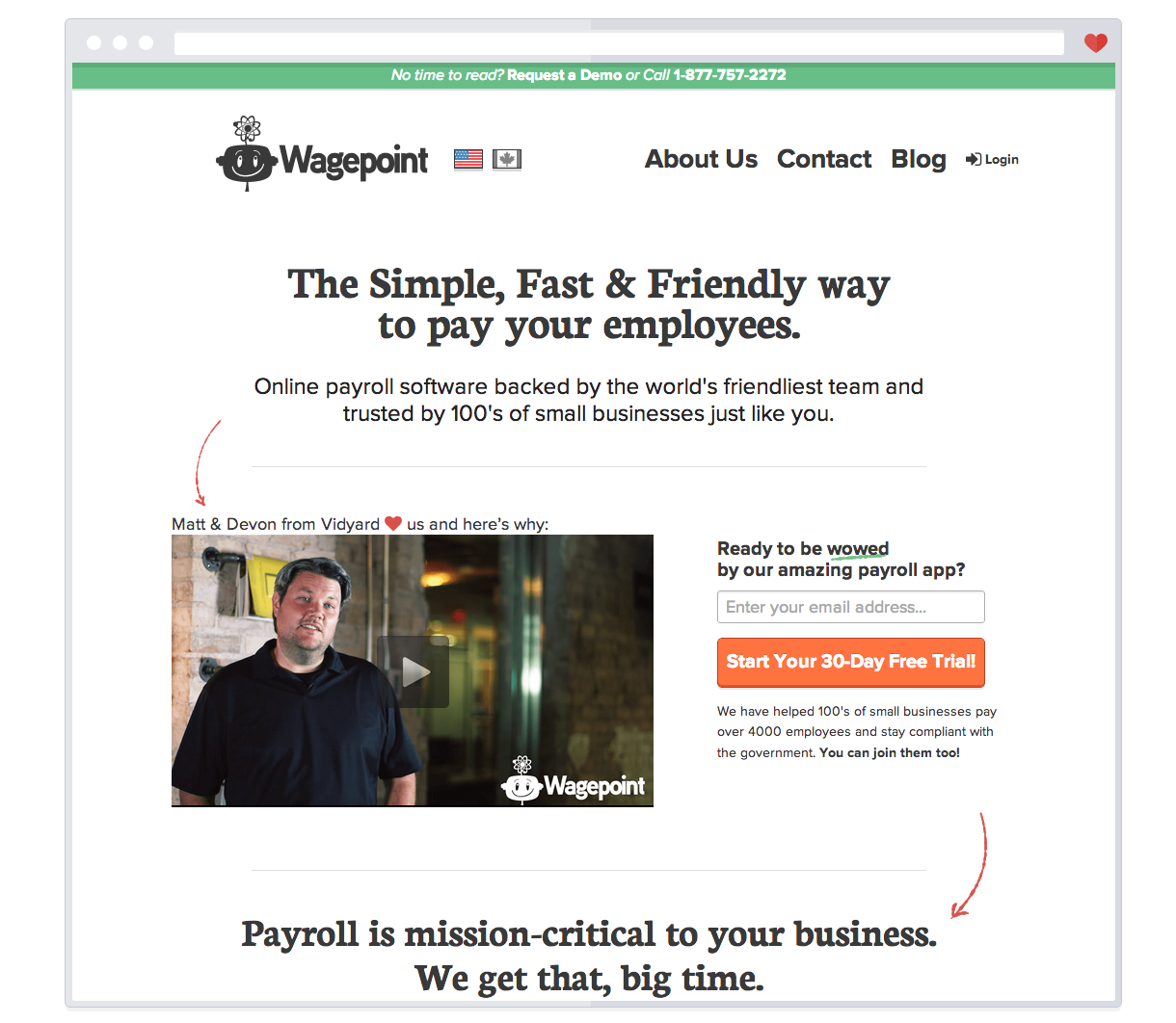
We opted for a single continuous scroll. All the way down a subtle orange arrow directs the reader’s eye. The copy carries the message. All supported with customer testimonials, first with a video, then with three quotes, complete with pictures of our happy customers.
The first two headers (known in design terms as H1 and H2) really sell the product: the problem, how Wagepoint solves it.
After that, if a visitor isn’t convinced yet, we actually show what the product looks like. Not all SaaS websites do this, but we think its important customers know what to expect.
We also illustrate the features with simple, clear graphics. Nothing fancy or complex.
Don’t lose your personality.

When we first started working on Wagepoint, we used to say things like ‘let’s put the fun back into payroll’ and some folks, the doubters, wondered whether that was even possible. They thought that payroll is such a serious subject that people might not want to be associated with anyone that makes light of it.
Here’s the thing though: we genuinely believe that you can find the ‘fun’ in anything, even in our online payroll system. Life is short and there isn’t a limit to the fun you are supposed to have so why not make every moment count?
So, despite the naysayers we plugged on. And guess what? People either love us or not – either way, they never feel lukewarm about us. Lukewarm equals totally forgettable.
We are in the business of payroll but we don’t believe that it needs to be boring, which is why we made sure our “Contact” and “About Us” pages still showcase our fun, warm and fuzzy personalities.
And we do the same with our copy as well. Wit and humour is very important to us.
So is transparency.
Unlike our larger competitors, we make our pricing clear right away and we also include a handy sliding calculator so you know exactly what you have to pay.
Coax to Action

This entire redesign would have been in vain if we had not made some optimizations to our CTAs.
From our experiences so far, we knew that a product demo was the best way to close a customer. It gave us a chance to learn more about their business, while showcasing the features of our product.
But, we also wanted to get more people to sign up for a free trial of our product.
We found a creative way to coax both actions.
We used a hello bar to draw a visitor’s attention to the option of requesting a demo if they didn’t have the time to read it all, and we used a sticky header for sign ups that would follow the visitor as they scrolled down the page.
Disclosure: The sticky header was inspired by Groove – we love the work they do, and we consider them one of the best SaaS companies out there!
So, there you have it. The tips and tricks that helped us achieve a 75% lift in our conversion rate. Share your experiences optimizing for conversion in the comments! We’d love to hear from you.
![]()