HR, simplified. So you can get back to business.
Managing HR tasks shouldn’t be a hassle. People by Wagepoint simplifies everything from time off management to employee records—so you can focus on your people, not paperwork.
(no offense, spreadsheets.)
Psst! You don't have to be a Wagepoint user to access the magic of People.

4.6/5
Capterra rating
99.9%
Uptime reliability record
2+hrs
Saved per week
*Reported by People users
Ready for action
in only 5 steps.
Intuitive and designed with humans in mind, our platform is quick to set up, simple to use and easy to implement.
Access employee data
any time, anywhere.
Adios, spreadsheets! Our cloud software centralized and updates employee data in one place that can be accessed whenever you want.
Backed by the world's
friendliest team.
Sleep easy knowing our team of in-house customer support specialists is here when you need them.
Built just for small
businesses.
We’re here to champion small businesses (we’re one too!) and make your life as easy as possible so that you can get back to doing what you love most.
Does this sound familiar?
"My Vacation balance is wrong."

Instead of:
Wasting time messing with spreadsheets and incorrect calculations.
Employees misunderstanding time-off benefits.
Time off issues and disagreements over balances.
You'll get:
Easy to use software with accurate policy calculations that are done for you.
One place to display all time off plans available to employees whether discretionary or required by law.
Tracked time off history and workflows that can help companies be transparent and compliant.
"I don't have a printer."

Instead of:
Gathering paper files each time a new hire starts (and inevitably missing one or two).
Sending important documents with personal info in a file attachment via email.
A disorganized onboarding process that leaves the employee hanging.
You'll get:
No more paper files or missing documents (bonus: No more filing cabinets).
An easy way to send new hire paperwork and collect eSignatures in a secure way.
A personalized onboarding page for each new hire, and a great first impression.
"You never told me I needed to improve."

Instead of:
Your team losing focus and not being sure if goals are progressing.
Poor performance going untracked, and putting off important discussions.
Drama surrounding conversations around poor performance actions.
You'll get:
Keep employee performance information in one place (and not on paper).
Better performance management helps your team stay on track with goals.
Employee access to past performance reviews keeps everyone in the know.
Features
Your one-stop employee resource tool
All function and no fluff, People helps small businesses organize
employee information and support compliance
(AKA proof that you’re following the rules).
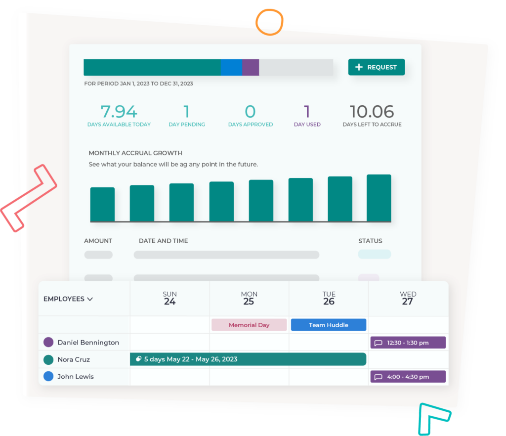
Time off tracking
No more tracking (or not tracking) time off in spreadsheets. Get easy access to requests, balances and plans.
Employee data management
Move away from spreadsheets and paper files. Organize data in one place, securely accessible from anywhere.
Employee onboarding
Stay organized during hiring with our templated tasks, files and customizable onboarding pages.
eSignatures
Easily let your team initial and sign contracts right within you new HR system. Bing!Bang!Boom!
File storage
Go paperless with electronic file storage and easily manage all of your employee files in one spot.
Employee performance
Open the lines of communication between you and your employees with our employee performance tools.
Loved by folks like you since 2013


Craig Lapan, FLIPP

Emily Rector, MarketScale

Blade Mages, Middle

Amy Drummond, Momentum
Pricing
Only pay for employees
who actually use People
Features
$3 USD
per user / month
$5 USD
per user / month
$6 USD
per user / month
Time-off & leave management
Employee HRIS
Team Directory
eSignature &
file storage
New hire onboarding
Objective tracking
Employee reviews &
custom templates
Startup
$3 USD
per user / month
- Time-off & leave management
- Employee HRIS
- Team Directory
Studio
$5 USD
per user / month
- Time-off & leave management
- Employee HRIS
- Team Directory
- eSignatures & file storage
- New hire onboarding
Growth
$6 USD
per user / month
- Time-off & leave management
- Employee HRIS
- Team Directory
- eSignature & file storage
- New hire onboarding
- Objective tracking
- Employee reviews & custom templates

People by Wagepoint FAQs
Got questions? We’ve got answers
Yes, we do! We service customers all over the globe, many of which reside in Canada.
Some of our most popular features are our Employee HRIS, Time-off & Leave Management and our eSignatures & File Storage. We also have a team directory, new-hire onboarding, objective tracking and many more features! Learn more
Absolutely. Our time-off system allows you to choose an accrual, upfront or unlimited policies, all with customizable options from accrual rate to custom holidays, to carryover balances into the next policy period!
The feedback we frequently get from our customers is that we offer a product that is easy to set up and simple to use, at a competitive price.
We have simple, per-user pricing. We don't have a contract and you can change plans at any time. Our customer support team is available any time throughout the day to help, either via a virtual meeting or our in-app chat.
At the moment, we do not integrate with Wagepoint payroll. This is at the top of our list for feature updates in the coming months.
Yes, absolutely! Our customizable file upload system includes the option to create digital signatures on any file of your choice, including tax documents in your country.
Our platform host has their own compliance records for SOC 1/2/3, PCI, and ISO. However, we follow best security practices based on those compliances, including GDPR. Your data is safe with us!